
Roava
Role :
Product Designer
Details :
Mobile finance experience for iOS and Android
Year :
2021
1.1 Overview
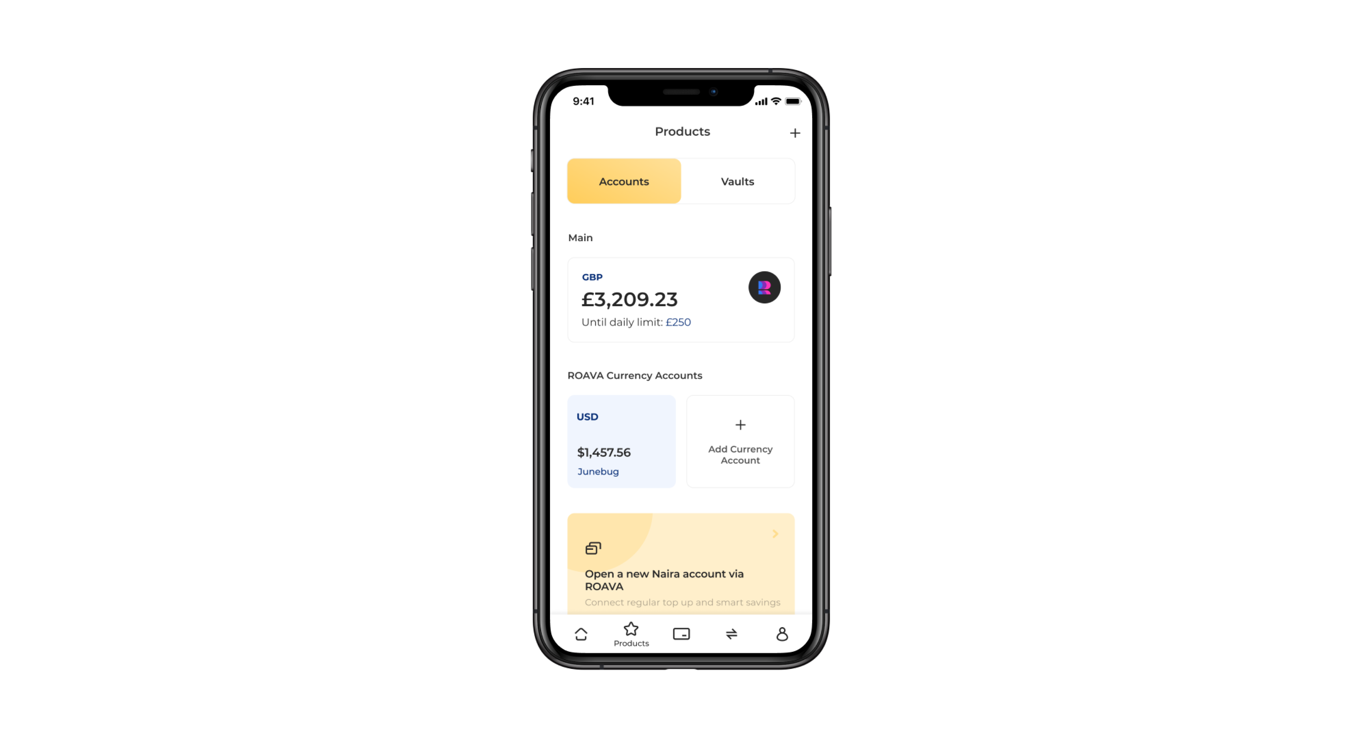
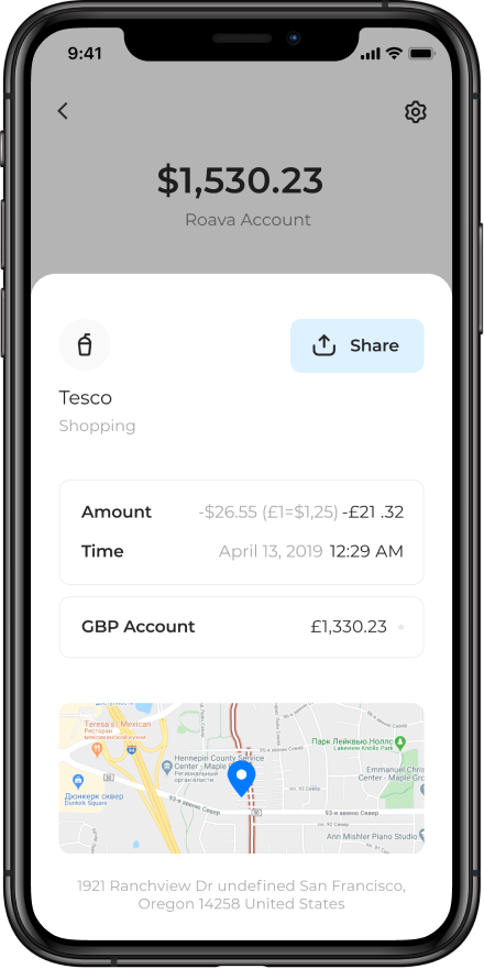
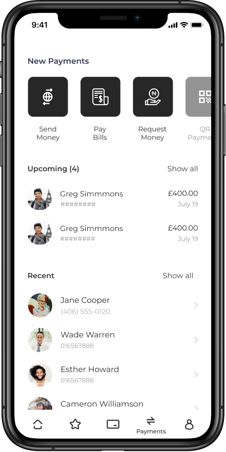
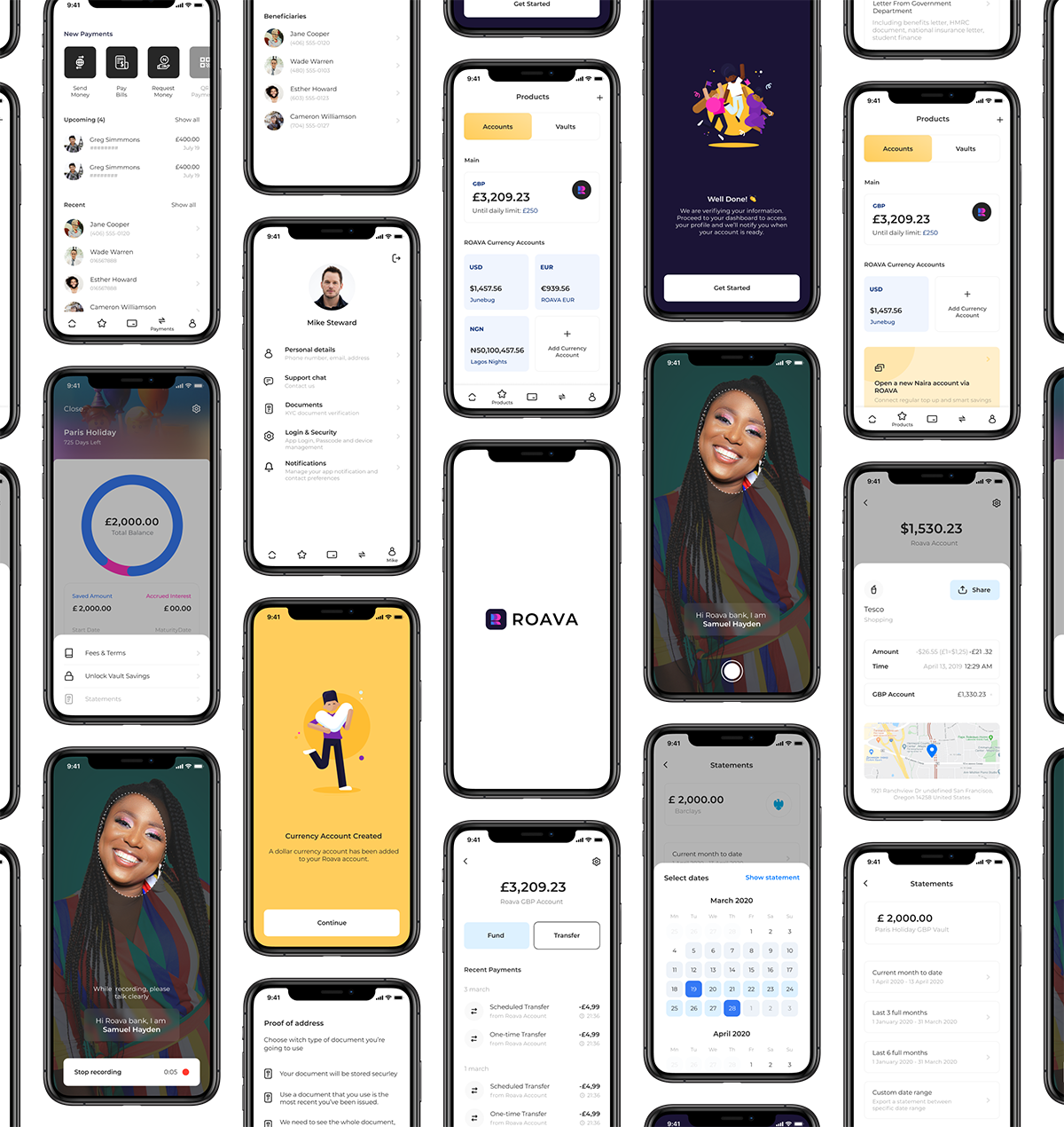
ROAVA allows its customers to manage their money, exchange international currencies, bills and savings from their phone.
I worked as part of a team of engineers, designers, and other managerial staff. I primarily reported to the Chief Product Officer, and the product managers.
1.2 Responsibilities & Business Goals
During my time working on the ROAVA project, my focus was centered around design systems, organisation and planning, and visual designs.
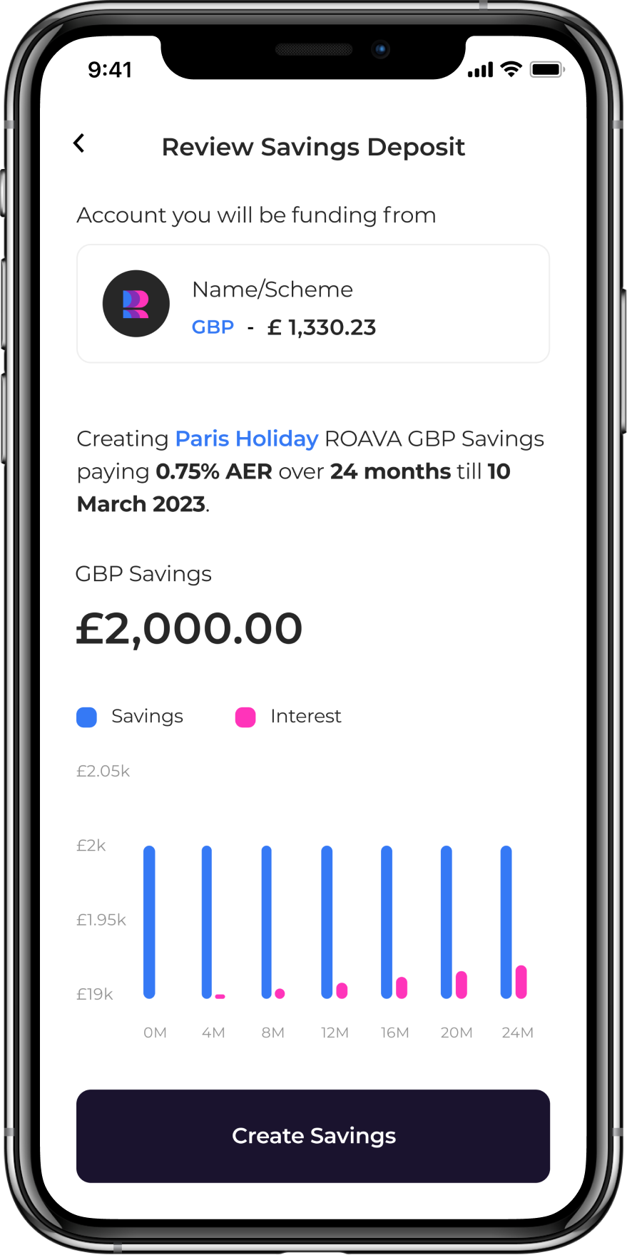
Design a mobile experience for customers to send and receive payments in multiple currencies, manage international commitments or support their travelling lifestyle without the restrictions of regular banking. The customers would also get real-time notifications when they spend funds or get paid. Savings vaults, fixed term deposit accounts offering high interest, should also be made available to all users.
2.1 User Research
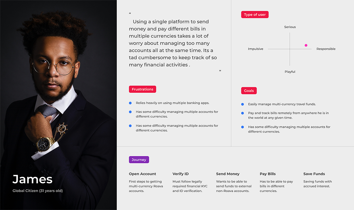
We started with user research and strategy workshops, building a solid understanding of the pain points of frequent travellers to multiple countries, as well as opportunities, and goals.
Initial Findings
With multiple currency accounts and different products all in one platform, the process of navigating multiple user journeys and flows made the application design complex and bloated from the very start. .
— Participants had difficulty interpreting the flow of information from one end of the application to the next.
— User Journeys without a clear direction presented a challange for users to move from screen to screen.
— Failure to properly manage excpectation of users lead to dissatisfaction and confusion and user’s interaction on the app.
3.1 Product Direction
Simplifying the ease of creating an account despite the financial regulatory requirements for the app was a vital part of the user's onboarding, without which, access to the core application features would not be granted.
With multiple currency accounts and different products all in one platform, the process of navigating multiple user journeys and flows made the application design complex and bloated from the very start.
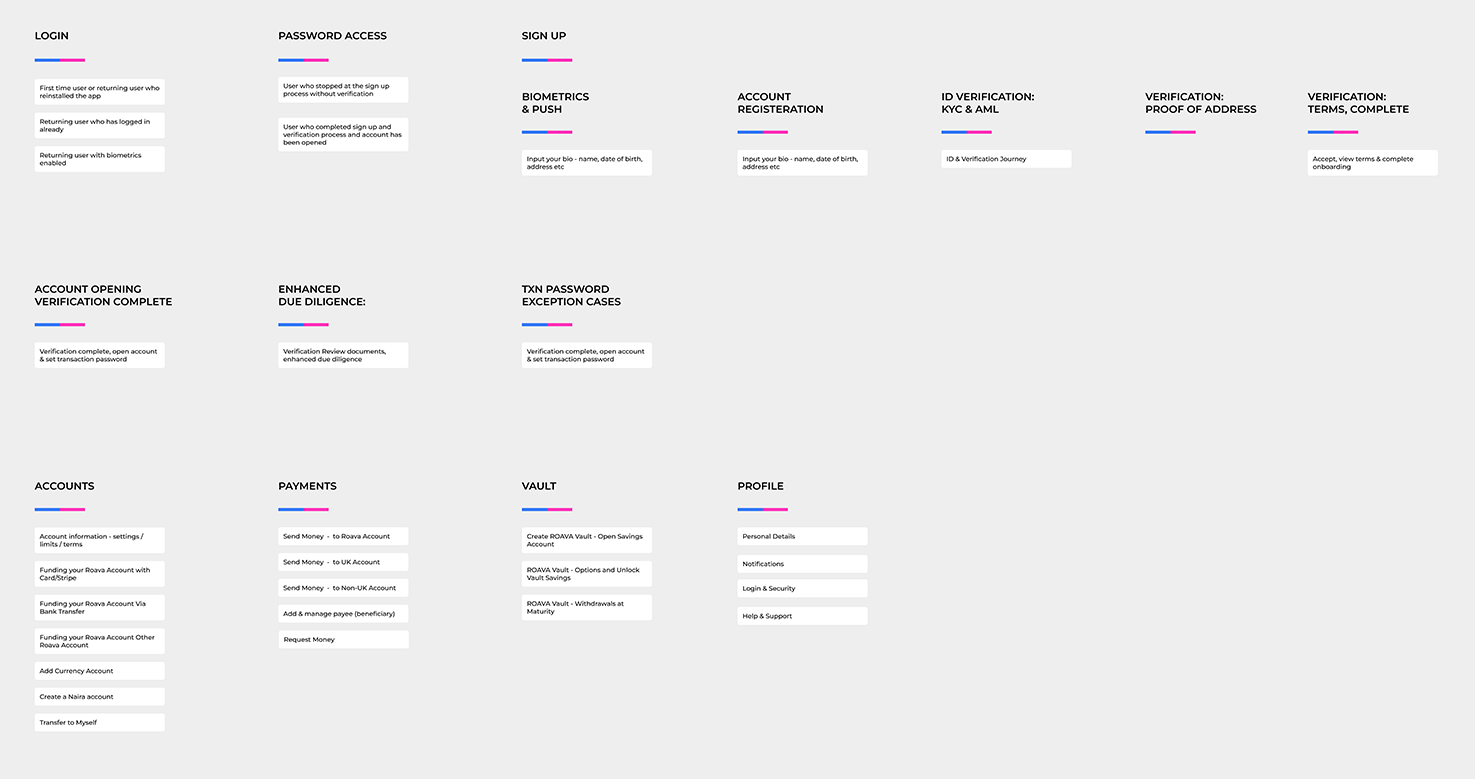
4.1 IA & User Flows
We aimed for security and ease of onboarding new users. The complexity of identity verification before gaining access to the core features of the app cannot be simply overlooked for a financial application.
The app should take new sign ups through a clearly detailed walkthrough of what to expect during the verification process.
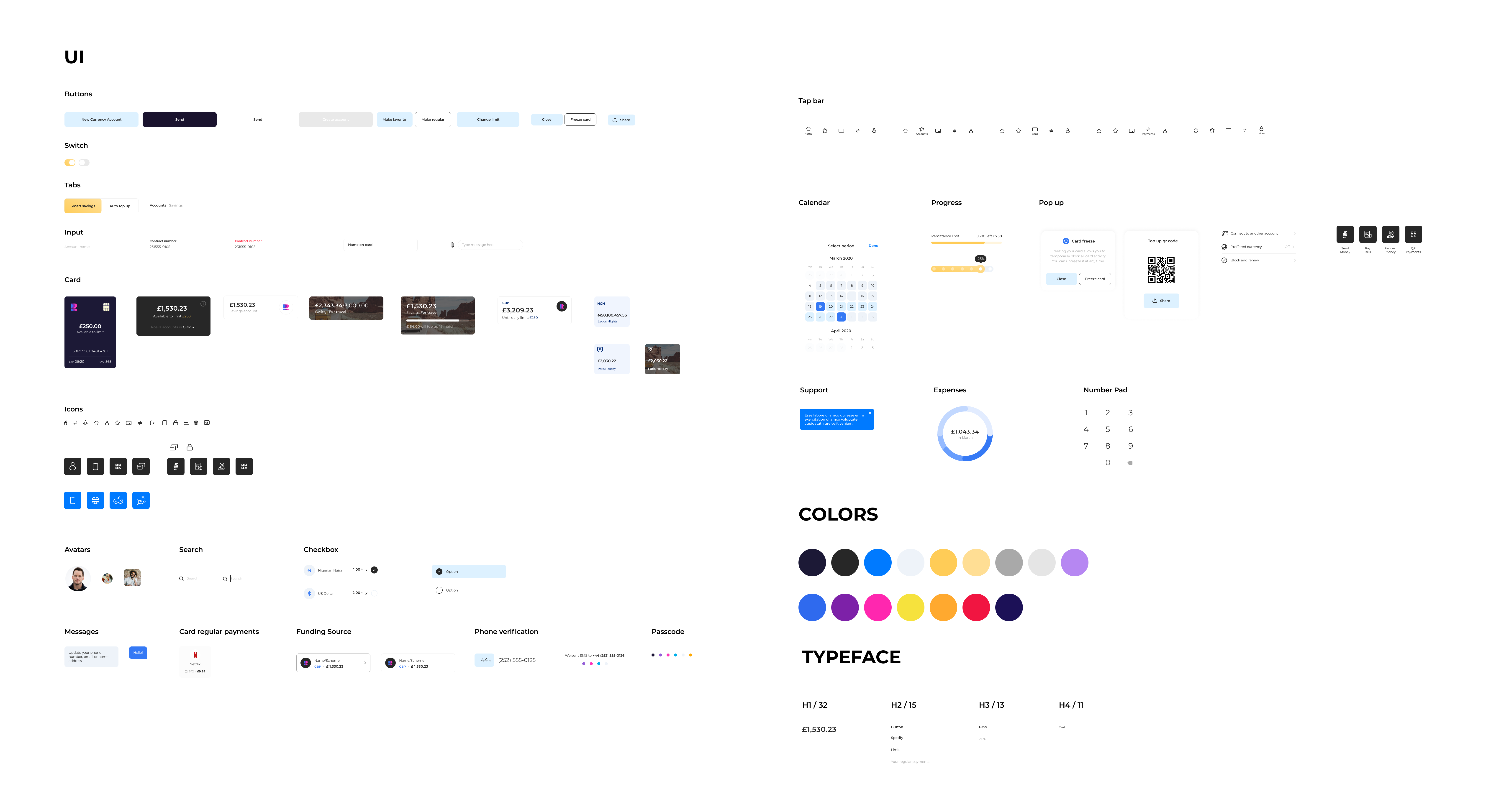
5.1 Branding, Style, and Design System
Our goal was to use a brand style that enhanced the reliability of the Roava application for users in different corners of the world.
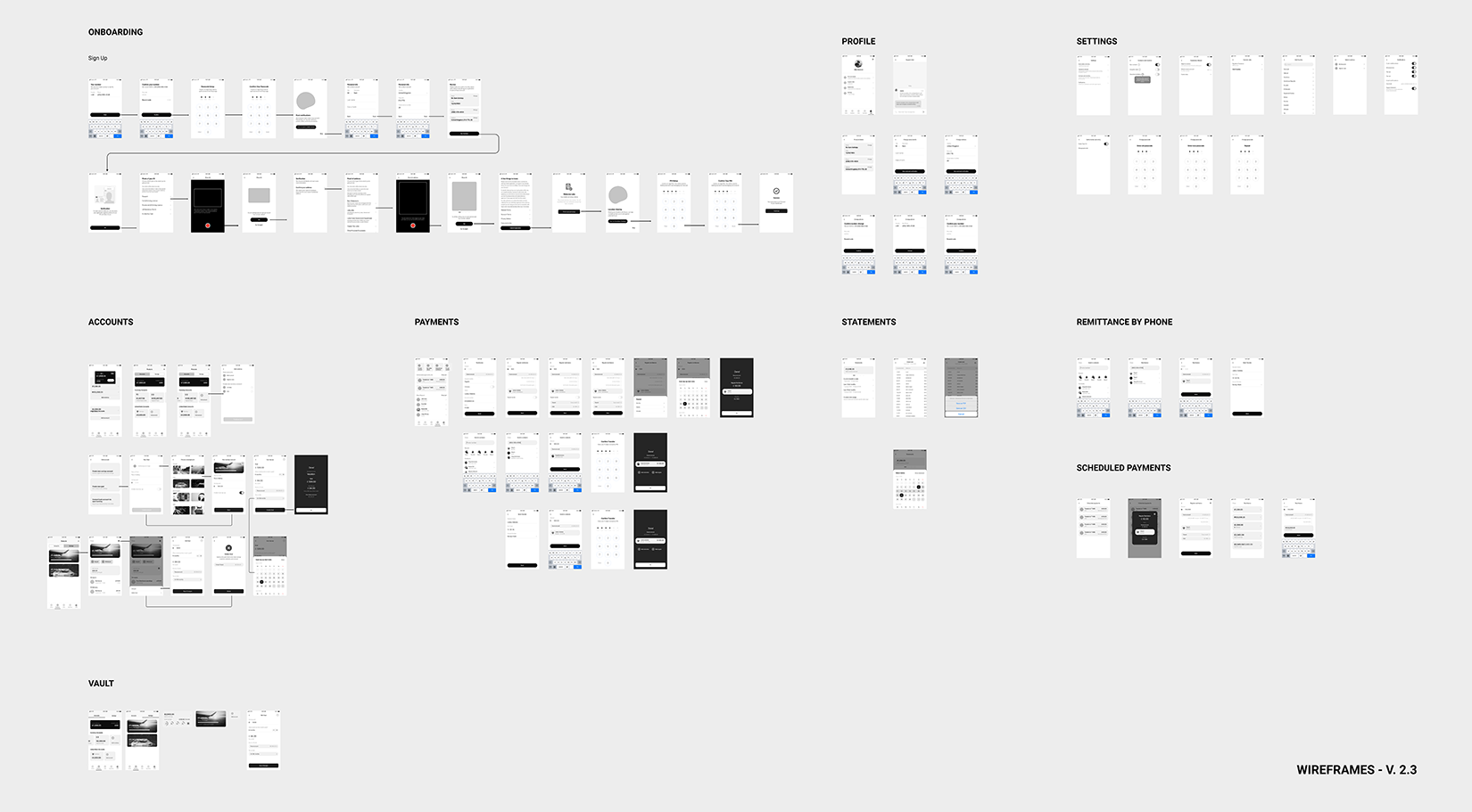
6.1 Wireframing and Feedback
Making the entire application the least complicated it could meant breaking all the journeys into smaller, independent, and self-contained bits.
Noting all drop-off points during the use of the mobile app was important for subsequent changes to the design.
7.1 User Interface & Prototype
Communication, testing, and feedback with management resulted in a reduction in the number of user journeys and features that were given different priorities.
A design system was created to facilitate quick changes to the designs as new observations were made and business-critical changes could be quickly adapted.
8.1 Conclusion
Validated all design assumptions and compare them with the expectations from the stakeholders.
To get an accurate evaluation of what the stakeholder thought, I invited the business managing director representing the stakeholders for usability testing. I also invited and got feedback from end-users to validate the design decisions we implemented in our prototypes.
8.2 Credits
Dennis Tamunotonye Dickson
Content Strategy, UX, UI
Branding
Next Project:
Zoafia